VICINITY
Course Project
Year: 2021
Vicinity is a concept for a website that I worked on for the George Brown UX Design Programme. This project delves into the information architecture of a website; starting with a brief, site map, user flow and annotated wireframes. To take it a step further I explored UI Design elements by creating a mood board, colour palette options and further created a style guide that included fonts, components and buttons.
Vicinity is on a mission to change the way you shop, by empowering your local stores, because that’s what this is about: encouraging shopping and investing in where it matters; home.
Vicinity is a website that offers a platform for local businesses who have been unable to set up an online presence to sell their products directly to their customers. Vicinity aims to support small businesses that want to reach their customers through an online platform but do not have the resources or infrastructure to do so. By partnering up with these neighbourhood businesses, Vicinity takes care of the online sales, shipping and delivery so that they reach a wider audience.
To start this project, the first thing I did was to list down all the important information that I needed to create a brief. Who were they as a business? What did they want to achieve with this website? What were their overall business and design goals? What was the objective of this website?
Project Summary
Vicinity requires a website that offers a platform for local stores to sell their products. The website should be:
a) well organised and easy for users to browse and shop from various store pages
b) easy for vendors to upload product images, set pricing and keep a track of inventory
c) responsive - focus on mobile-first design, offering easy navigation to make browsing and purchasing seamless
d) modern and sleek design, showcasing the various vendors and their products
Website Objectives
• Increase relevant traffic and convert to sales
• Help local businesses reach a wider audience
• Help users support the local businesses they care about, by making them more accessible
• Provide a unique customer experience, that feels personalised and meets users needs
• Support the vendors by showcasing them and their products so they reach their target audience and make more sales
• Provide an extensive search to help users find what they are looking for with ease
• Include a distraction-free path-to-purchase with a simple checkout process
Overall Business Goals
• Build a loyal partnership with local businesses that attract more vendors
• Create a brand name that is known for supporting local, and placing neighbourhood stores at the front and center
• Become the leading name in Toronto for satisfying all consumer needs by partnering up with the right vendors
• To provide a service that can be adopted in more cities across Canada
• To become the go-to destination for users and vendors across Canada to choose for their shopping
Design Goals
• Should look modern, sleek and focus on highlighting the products and vendors
• Should be user-friendly and easy to navigate and filter through all the different pages
• Should have a focus on imagery, to showcase products in an eye-catching way
Competitive Landscape
Toronto Market Co.
Curated market that celebrates Toronto’s designers, artisans, chefs, entrepreneurs, bakers and makers. Delivers around the GTA for a fee.
Nishe
Lists independent brick-and-mortar stores, you can buy certain products from some stores.
Runner
Includes a unique selection of home essentials that have been curated by them that can be ordered and delivered within an hour. This includes organic snacks, high end home and everyday goods as well as alcohol.
Amazon
Amazon offers a convenience that is unmatched. With the price point and the large inventory, Amazon will always be a direct competitor to all local stores.
The next step was to identify who their target audience was, and then try and understand what their needs were based on what they wanted to accomplish. Since this was a concept, I was unable to conduct stakeholder interviews, but I did look into who Vicinity's competitors were and what they were trying to achieve. By acknowledging the users and the competition, I also pinpointed things that needed to be overcome.
Target Audience
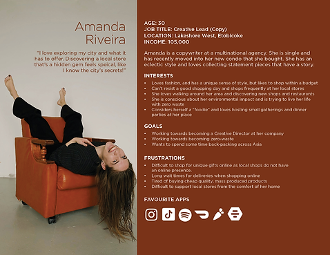
• The target audience for Vicinity are people between the ages of 25-55.
• They have a household income of 95k+
• They are passionate about supporting local stores in the city
• They are professionals who are invested in the community and want to see their neighbourhood thrive
• They are tech savvy and avid online shoppers but are looking for unique products that you cannot find on Amazon
• They care about where things are made and the story behind these products
• They are conscious about their environmental impact and transparency from the businesses they interact with
User Personas


User Needs
• To be able to browse through smaller local stores and their products in an easy and accessible way; all in one place
• To discover new products and stores in an interesting way from the convenience of their home
• To be able to track deliveries with ease
• Discover new stores that are outside their immediate area
• Have access to 100s of products at an affordable price
• To have complete transparency from companies about their ethical practices
Things to Overcome
• Have the search as intuitive and extensive as possible - tag items
• Uploading information for the vendors need to be easy to use
• Make sure the hierarchies and naming conventions are easily recognisable and organised
• Capture a sense of community through the shopping experience
It was now time to start thinking about the information architecture of the website. How was this website going to be structured? I had to think about the Global Navigation, how extensive it should be and what it should include. What does the hierarchy look like for this website? I needed to address what is included in the Courtesy Navigation as well as the Footer Navigation, the best visual representation of this would be an annotated Site Map.
Annotated SiteMap For Vicinity

I started thinking about the key tasks that the users would have to accomplish while visiting the website. It is an e-commerce website therefore the main goal for the user is to buy a product. While plotting out my user flows, it occurred to me that there is another user that is just as important to focus on; the store profile. The idea is for the store to be able to have access to their products, prices, images so they can easily update these things without having to contact Vicinity’s back-end team, this gives them more control over the decisions they make. The following User Flows include:
-
Signing up as a Store
-
Managing a Store - Adding a New Product, Edit Pricing, Print and Save Sales Reports
-
Signing up as a Customer
-
Buying a product
User Flows - Store


User Flows - Customer


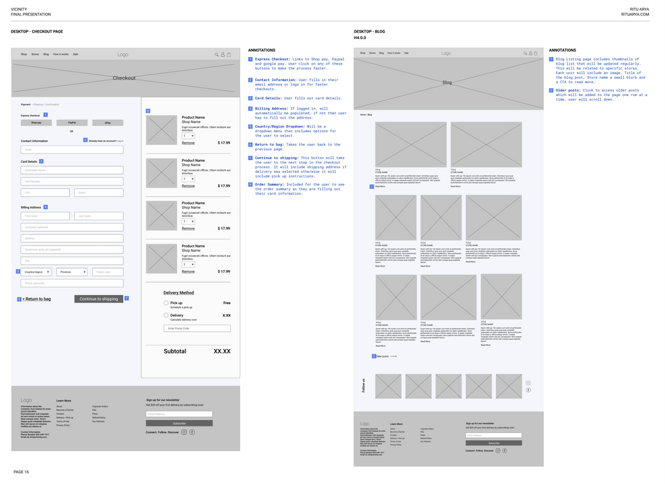
Once I had the User Flows plotted out, it was time to work out the wireframes for the website. I referred back to my sitemap and made of list of the most important pages that would be required to be templated for Mobile and Desktop. Designing the smallest screen first was important to help focus on the core functions of the product which helped prioritize the most important aspects of the website. Users' habits have changed over the years where over 90% of the global internet population uses a mobile device to go online, so it was important to design mobile-first versus mobile-friendly.
I included the following pages for the wireframe templates:
-
Homepage
-
Shop page
-
Stores Home
-
Stores Individual Pages
-
Product Page
-
Shopping Bag
-
Checkout Page
-
Blog Page
-
Info Page
-
Manage My Store
-
Navigation
Wireframes - Mobile and Desktop
To complete the project I wanted to come up with a style guide and a High-Fidelity version of the homepage for mobile and desktop. I wanted the main focus to be the photography to really showcase the businesses and their products. The charm of an independent store in your area cannot be matched online, but I wanted to capture the essence by making sure the website was a blank canvas for these stores to really shine. I wanted the look and feel to be very sophisticated and timeless.


Key Takeaways
This project helped me understand how important it is to have a plan to work through problems step-by-step, as you get through each process you learn how one affects the other. As this project was a concept, it did not have any formal user research or usability testing, I acknowledge the fact that with that kind of input some decisions would have been made that would have affected the overall outcome. The purpose of this project was to explore the information architecture of a website. A few things I learnt through this process was:
-
Card sort would have helped define the categories better
-
Identifying your user is key - user persona helps us understand who you are designing for
-
User Flows help narrow down the key functions of the product and can help recognize any potential pain-points
-
Designing Mobile-First helps you focus and keeps the design de-cluttered


